It looks like a developer designed it!

We have all heard it. Developers are not good at design.
Thankfully, we have UX-designers. I have had the pleasure of collaborating with excellent designers in my time and have seen firsthand the importance of their work. Sadly, as developers we are not always blessed with a designer on our team...
In this blog post I will highlight design principles that every developer should know. Apply these principles and you have come a long way in improving the user experience of your product. Those principles are
- Visual Hierarchy
- Whitespace
- Alignment
- Contrast
- Grouping
1. Visual Hierarchy
Visual hierarchy is usage of visual clues to orders elements by importance. Visual hierarchy helps our brain to focus on the most important elements first and serves as a guide to where a user should look. There are many characteristics that can be altered to increase / reduce the importance of an element such as size, color or contrast.
A user's reading pattern is culturally influenced so a western user would normally read you design from left-to-right. One can then apply visual clues to either
- Break the expected pattern
- Reinforce the expected pattern
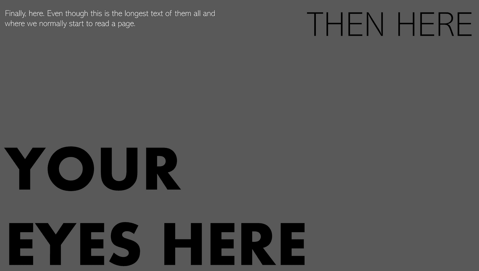
On the image below, size is used to break the expected reading pattern
2. Whitespace
Whitespace is space between design elements or within a design element. It is also referred to as negative space and is used to increase both the aesthetics and the efficiency of a page. Below we see a poor uses of whitespace on the left image. Even though some effort has been put in to improve visual hierarchy in terms of sizing and colors, the design is too cramped. On the right image, whitespace has been properly applied which results in a better design. Take note of how "BUY NOW" comes alive with proper whitespace usage both around and within the element.


3. Alignment
Alignment refers to the placement of elements related to each other. It is used to create structure to a page and makes a design look more professional. Alignment is often not recognized when executed properly, but one would definitely miss it should not it be. This can be seen when comparing the two layouts below.


4. Contrast
Contrast is difference between elements. A well-known example of contrast is text color compared to background color. Poor contrast results in unreadable text and one must always keep in mind factors such as color blindness as well.
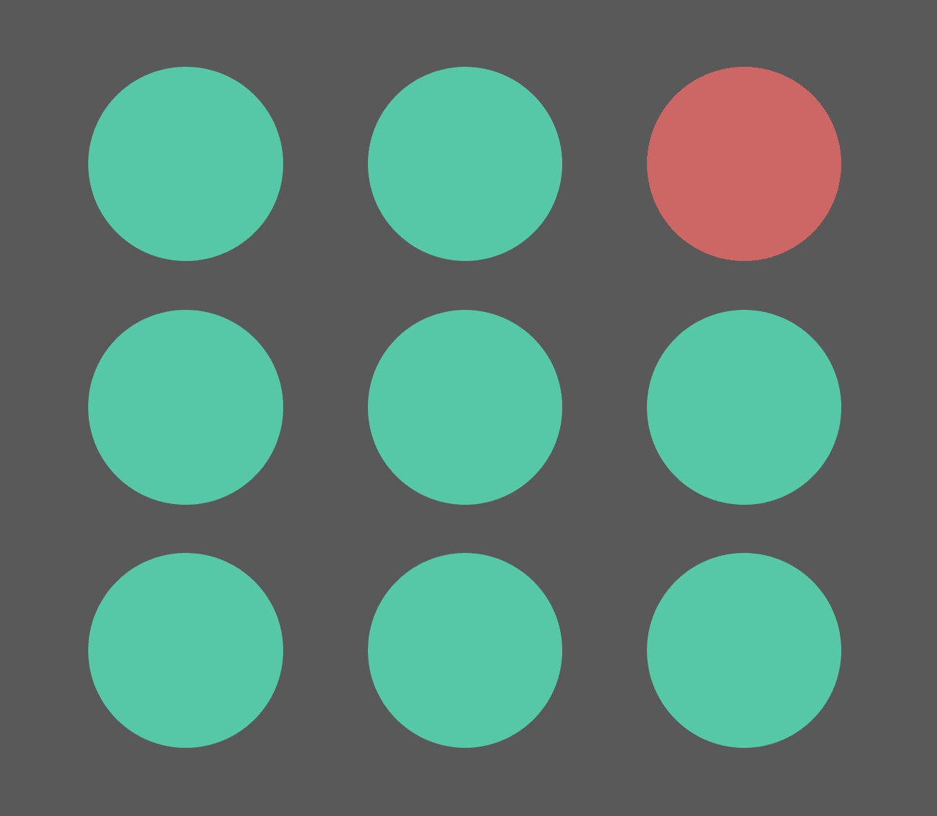
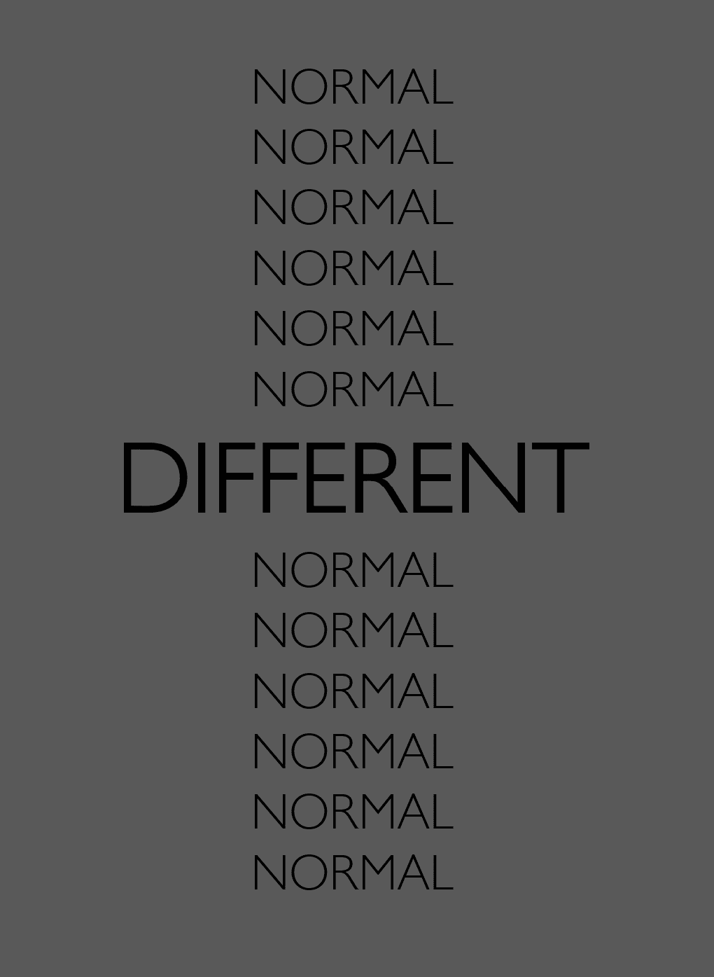
Contrast comes in many forms and can be adjusted to improve visual hierarchy. In the following examples one can see different types of contrast utilized for visual effect, such as color, shape, size and fonts. An interesting factor is that one might have to deliberately challenge other design principles, e.g. alignment, to create the desired effect.


5. Grouping
Objects closely placed are perceived as related and form groups. Element that are logically connected should therefore be placed close to each other. For instance, a label should be near its corresponding input field.
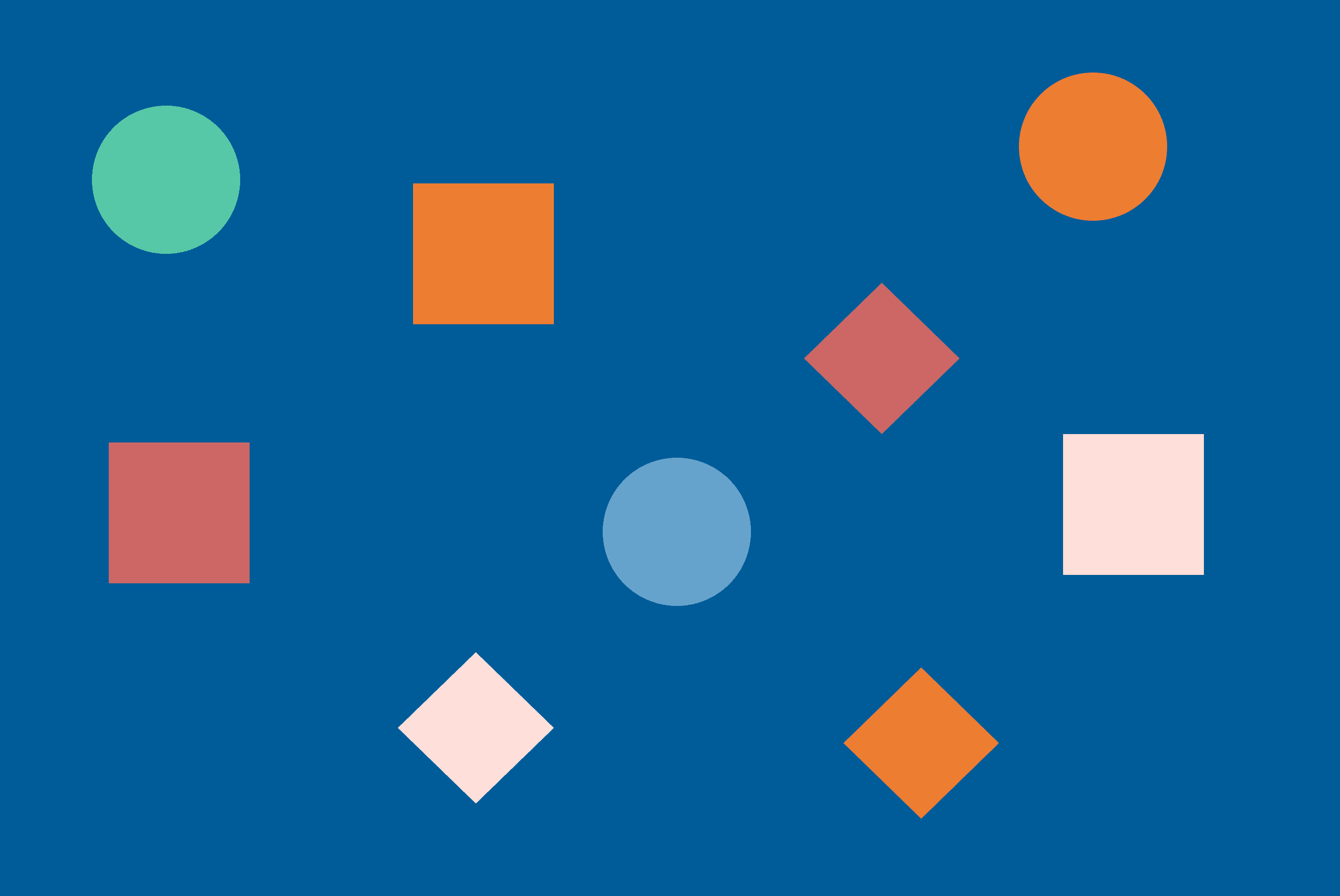
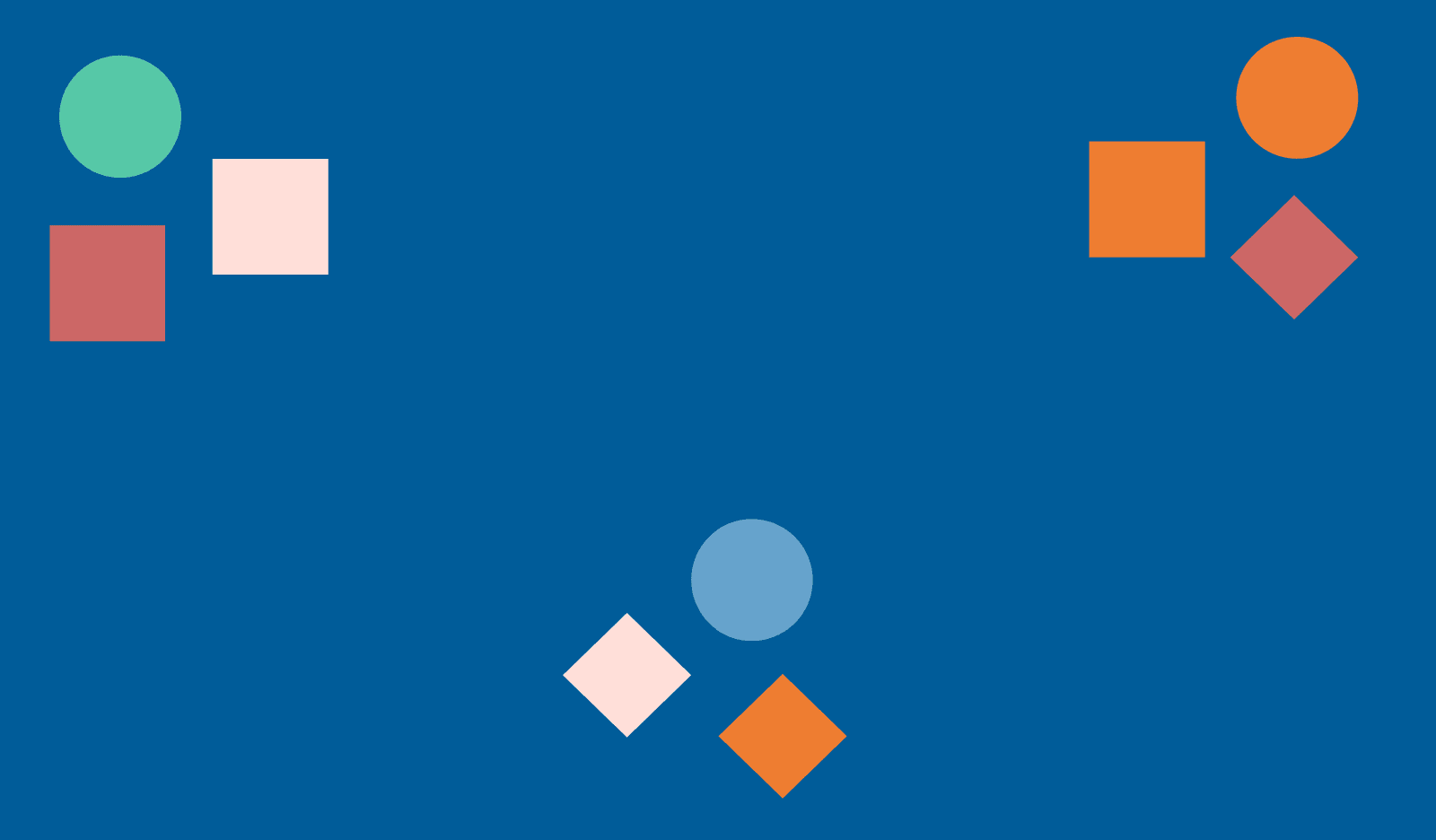
Grouping can also be utilized to minimize noise and to "reduce" the number of elements on the page. In the example below, both designs hold nine elements in total. When looking at the design on the right, the design is perceived as having three groups of elements instead of 9 individual elements. Even though the elements are different in terms of shape and color, we still visually group them just because they are located close to each other.
